
Brand kit
Logos, colors, copy and guidelines for presenting Protofire Multisig and Protofire — for partners, networks, press and community.
About
Ready-to-paste descriptions. Use the length that fits the space; do not rewrite the core message.
Protofire Multisig — short
Protofire Multisig is the Safe-based multisig UI with the widest network coverage, 80+ chains, and extra features on top. Built on the official Safe contracts with verified bytecode and a familiar interface. Battle-tested and open to everyone.
Protofire Multisig — long
Protofire Multisig brings Safe’s audited, official contracts to 80+ chains in a single interface. Teams, DAOs and protocols can create and manage multichain accounts; propose, sign and execute transactions; set spending limits; and connect to dApps directly from their Safe. Same verified bytecode and familiar Safe experience, with extra features on top. Run as public infrastructure, open to everyone and maintained by Protofire.
Logos
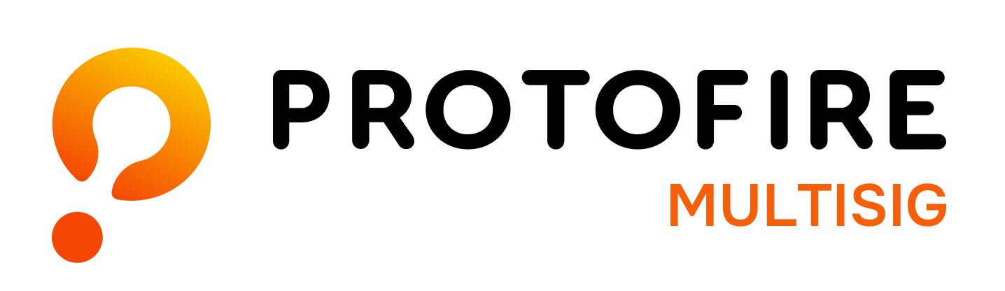
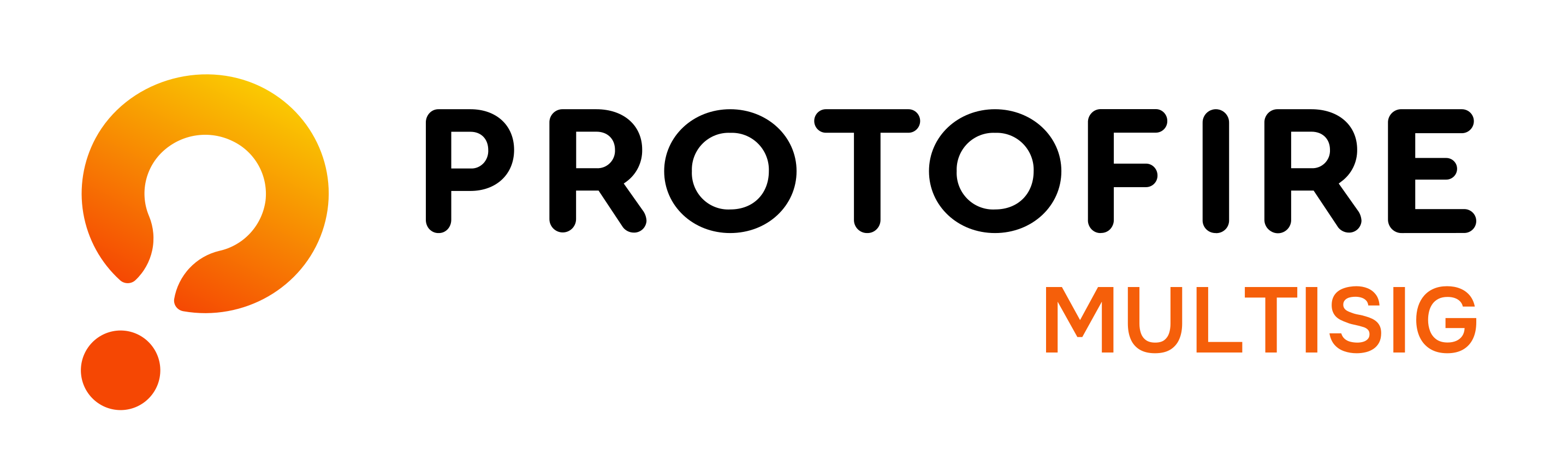
Always use the shipped files. Pick the variant by background: dark-text files go on light backgrounds, white-text files go on dark backgrounds.
Protofire Multisig — product logo
Squared icon
The icon with the word MULTISIG, in a rounded square. For app icons, avatars, social profiles and any square slot. Keep it at 64 px or larger so the word stays legible.
Logo usage
Short rules so the brand stays consistent across partner pages, announcements and decks.
Do
- Write the name as Protofire Multisig — two words, no hyphen.
- Use the shipped SVG/PNG files and match the variant to the background.
- Leave clear space around the logo equal to the width of the icon's detached dot.
- Pair with "Powered by Safe" in text when the relationship needs to be stated.
- Use the squared icon only where the full logo does not fit (app icons, avatars, social profiles), at 64 px or larger.
Don't
- Redraw, recolor, rotate, stretch or add effects to any logo.
- Place a logo on a busy background or low-contrast color.
- Use the Safe logo, or imply the product is made or endorsed by Safe.
- Call the product "Protofire Safe" or describe it as a Safe product.
- Retype the "PROTOFIRE" wordmark in a font — it is custom lettering.
Colors
Based on the Protofire palette. Click any swatch to copy its hex value.
Core
Logo colors
Fire gradient (logo mark)
Accents — use sparingly, never compete with the orange mark
Typography
Onest is the brand typeface for text. The "PROTOFIRE" wordmark inside the logo is custom lettering and must not be typed out.